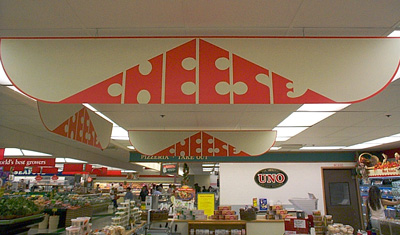
A nicely self-descriptive sign.
I think this is actually the best of all the signs on my pages of bad signs. I would have to say I like it as least as much as I like cheese. (Bear in mind there is nothing I like less than cheese.)
(Stop & Shop, South Bay Plaza)
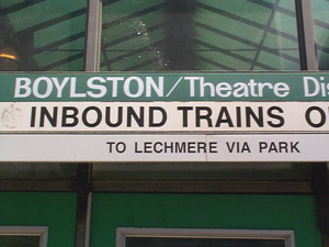
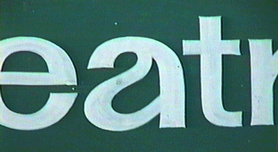
MBTA signage: Finding new ways to make Helvetica uglier.
(Boylston station.)

HAY DØØD !!!!1 MY NAMEZ BIFF !!!!!!1 THE BIFFSTER !!!!!!!!1
WHY R THEIR 2 "Ø" KEYZ ØN THIS CØMPUTØR ??///
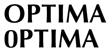
One of these letters is not like the others... because it's a digit.
This is kind of subtle if you don't notice that in the typeface in question (Optima) the capital "O" is a circle, and the zero is an ellipse... which isn't quite as tall as the "O".
(Lechmere's original store, now thankfully out of business after too many people got wise to the fake "sale" signs on every item.)
![J[]ES BOVTIQ|_|E](joes_boutique.gif)
So, was this typeset at 2540 or 3600 dots per inch?
Note the clever contrast of round with square, thick with thin, crooked with sloppy.
(Also, why would you need the phone number if you were on the sidewalk in front of the store?)
(Dudley Square, Dorchester.)
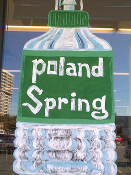
Drinking pure mountain water will make you as beautiful as this lettering.
Gee, it's not like the sign-painter would have had to expend much effort going into the store to look at how the "O" was shaped on the actual bottle.
Why can bad letterers draw curves in every letter but "O"?
(Osco drugstore, Twin Cities Plaza, East Cambridge.)

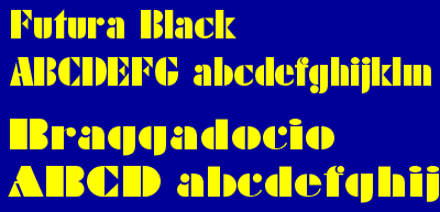
One door's Futura Black. One door's Braggadocio. Together, they're wacky crime-fighting fonts!
Futura Black was designed in 1930 (or earlier) by Paul Renner for Bauer. Braggadocio, the cheap imitation, was designed in 1930 by W. A. Wooley for Monotype.
(This photo is posted solely to amuse Matt McIrvin at Rudi Gernreich's expense by way of Gerry Anderson's typography. Don't ask.)
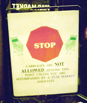
Okay, (1) it's mis-oriented, (2) the octagon has nine sides 'cause a corner got chopped off, (3) it's not red, it's pink, (4) it's suffering from tiny type, (5) using a "fun 'n' friendly" font that says "pretty please sort of stop", and (6) the type has sunk south of the equator. This "STOP" sign makes me want to DRIVE MY CAR THROUGH THE MARKET!
(Star Market, Prudential Center.)
Apologies for the poor quality of the above photo, but it's hard to focus on a sign of that ugliness.
Here is my expert attempt to draw a cleaner version for you to behold:
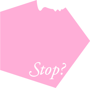
(Artist's Conception)